Menu Widget
Animated Hierarchical Sidebar
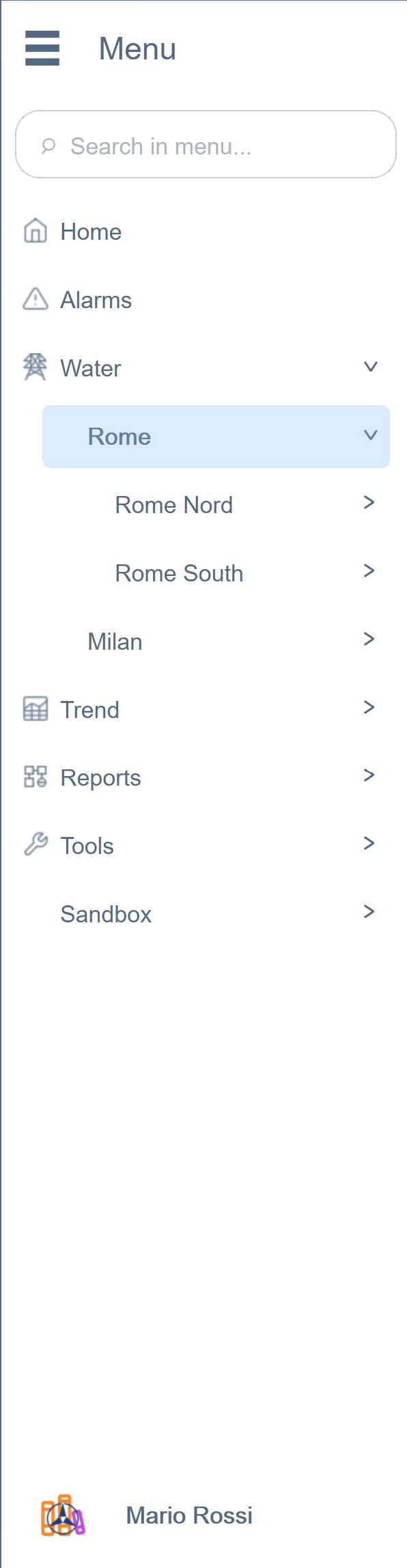
The Menu EWO is the primary navigation component of the application — a collapsible hierarchical sidebar with smooth animations, real-time badge propagation, search filtering, and a fully integrated user profile section.
Key Features
Animated Expand/Collapse
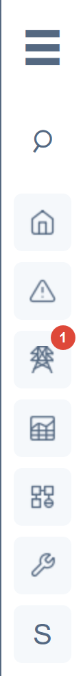
The menu transitions between expanded and collapsed states with coordinated parallel animations — width changes and opacity fades run simultaneously with independent easing curves, creating a fluid, professional feel.
Level-Based Styling
Each depth level of the tree can have its own font, size, weight, color, height, and indentation — all configurable via JSON. This means section headers look different from leaf items without any custom code per page.
Real-Time Badge Propagation
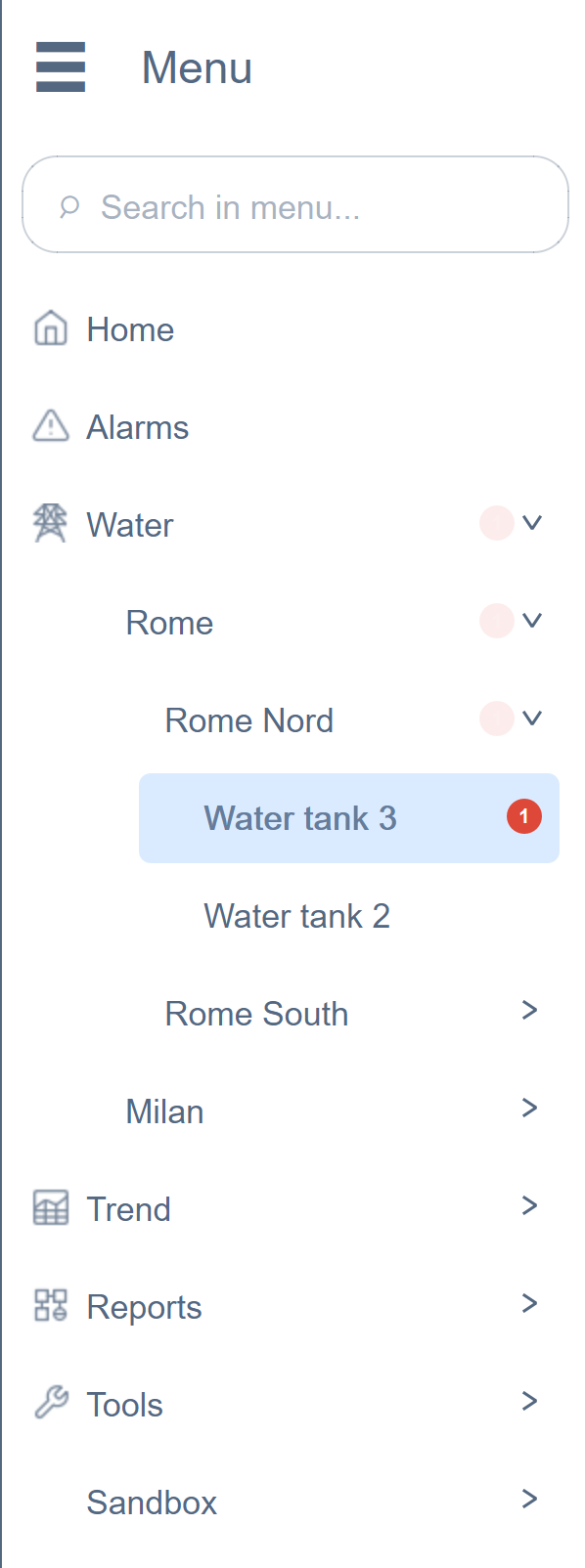
This is one of the most impactful features we built. When a child item has an alarm or a failed condition, a red badge with a counter appears — and it automatically propagates upward through the entire tree.
How It Works
A centralized Condition Manager (a dedicated background process) monitors all configured datapoints via a single set of connections. When a value fails its expected condition, the badge count increments on the leaf item and propagates bottom-up through every ancestor. All UI components — Menu, DropMenu, quick-function buttons — read from a single published result. No panel needs to manage its own monitoring.
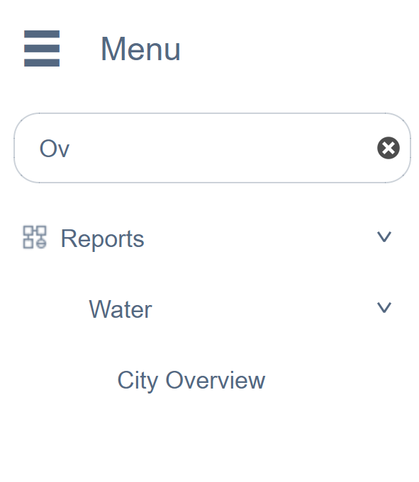
Built-In Search
Type in the search bar and the tree filters in real time — matching items remain visible with their full ancestor path, non-matching items disappear. This works even on menus with hundreds of items.
Additional Capabilities
- 3-dots context menus per item for actions like rename, move, delete
- User profile section at the bottom with toggle switches and dropdown menu
- Dollar parameter passing — each item can carry
$DPvariables that are passed to the panel it opens, enabling reusable panel templates across hundreds of pages - 31 configurable properties — colors, fonts, sizes, animations, all customizable at design time
Main Properties
| Property | Type | Description |
|---|---|---|
menuJson |
QString |
JSON tree structure defining all menu items |
menuTitle |
QString |
Title displayed at the top of the sidebar |
menuSubtitle |
QString |
Subtitle below the title |
showTitle |
bool |
Show/hide title bar |
showCollapseButton |
bool |
Show expand/collapse toggle |
show3DotsButton |
bool |
Show context menu button per item |
searchVisible |
bool |
Show built-in search bar |
searchPlaceholder |
QString |
Placeholder text for search input |
selectedItem |
QString |
Currently selected item ID |
accentColor |
QColor |
Accent/highlight color |
backgroundColor |
QColor |
Sidebar background color |
textColor |
QColor |
Default text color |
hoverColor |
QColor |
Item hover background |
selectedColor |
QColor |
Selected item background |
iconSize |
int |
Menu item icon size |
autoCollapseSiblings |
bool |
Auto-close siblings on expand |
rootItemHeight |
int |
Root-level item height |
childItemHeight |
int |
Nested item height |
levelStylesJson |
QString |
Per-depth-level font/color overrides |
badgesEnabled |
bool |
Enable alarm badge propagation |
userProfileJson |
QString |
User profile section configuration |
enableShadow |
bool |
Drop shadow on sidebar |
Note: This widget exposes 30+ configurable properties. The table above covers only a selection — dozens more are available for fine-tuned control over colors, fonts, padding, animations, and behavior.
Usage Example in WinCC OA
XML Configuration (extended properties)
<extended>
  <prop name="backgroundColor" type="COLOR">{211,211,211}</prop>
  <prop name="accentColor" type="COLOR">{192,193,195}</prop>
  <prop name="textColor" type="COLOR">{90,93,93}</prop>
  <prop name="selectedColor" type="COLOR">{198,198,198}</prop>
  <prop name="fontFamily" type="CHAR_STRING">Arial, Arial, sans-serif</prop>
  <prop name="buttonFont" type="FONT">-1,11,-1,5,600,0,0,0,0,0,0,0,0,0,Inter</prop>
  <prop name="titleFont" type="FONT">-1,14,-1,5,700,0,0,0,0,0,0,0,0,0,Inter</prop>
  <prop name="subtitleFont" type="FONT">-1,10,-1,5,400,0,0,0,0,0,0,0,0,0,Inter</prop>
  <prop name="rootItemHeight" type="INT">40</prop>
  <script name="itemClicked">itemClicked(string itemId, string path, string text)</script>
  <script name="menuDimensionsChanged">menuDimensionsChanged(int width, int height)</script>
  <script name="itemOpenInNewTab">itemOpenInNewTab(string itemId, string path, string text)</script>
  <script name="menuStateChanged">menuStateChanged(bool collapsed)</script>
  <script name="userProfileMenuItemClicked">userProfileMenuItemClicked(string itemId, string text)</script>
</extended>
CTRL Initialization Script
main()
{
  // Load menu structure from datapoint
  string json = dpGet("System1:Menu.structure");
  EWO.menuJson = json;
  EWO.badgesEnabled = true;
}

// Handle menu item click — navigate to the selected panel
void itemClicked(string itemId, string path, string text, string dollarParam)
{
  // Open the panel associated with this menu item
  string panelPath = "panels/impianti/" + itemId + ".xml";
  ModuleNavigation_openPanel(panelPath, "$DP:" + dollarParam);
}

// Handle menu collapse/expand for layout adjustment
void menuStateChanged(bool collapsed)
{
  int menuWidth = collapsed ? 60 : 280;
  setValue("mainContent", "position", menuWidth, 0);
}
Available Signals
| Signal | Parameters | Description |
|---|---|---|
menuItemClicked |
itemId, path, text, dollarParam |
Item selected |
menuItemRightClicked |
itemId |
Right-click on item |
menuItemOpenInNewTab |
itemId, path, text, dollarParam |
Open in new tab |
menuItem3DotsClicked |
itemId, text, path |
Context menu on item |
menuHeader3DotsClicked |
— | Context menu on header |
userProfileClicked |
— | Profile section clicked |
userProfileMenuItemClicked |
itemId, text |
Profile menu item selected |
userProfileSwitchToggled |
itemId, text, checked |
Profile switch toggled |
menuStateChanged |
collapsed |
Expand/collapse state changed |
searchTextChanged |
text |
Search input changed |
menuJsonChanged |
json |
Menu structure updated |
menuDimensionsChanged |
width, height |
Widget size changed |