IoField Widget
The Swiss Army Knife of Dashboard Cells
The IoField is the most complex widget in the library (~3,000 lines of C++) — a multi-purpose dashboard cell that combines value display, embedded graphs, mathematical expressions, and in-place editing into a single, highly configurable component.
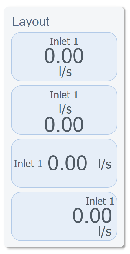
Layout Flexibility
Every IoField can be arranged in different orientations and element positions. The widget dynamically adjusts its internal layout based on configuration:
Visual Customization
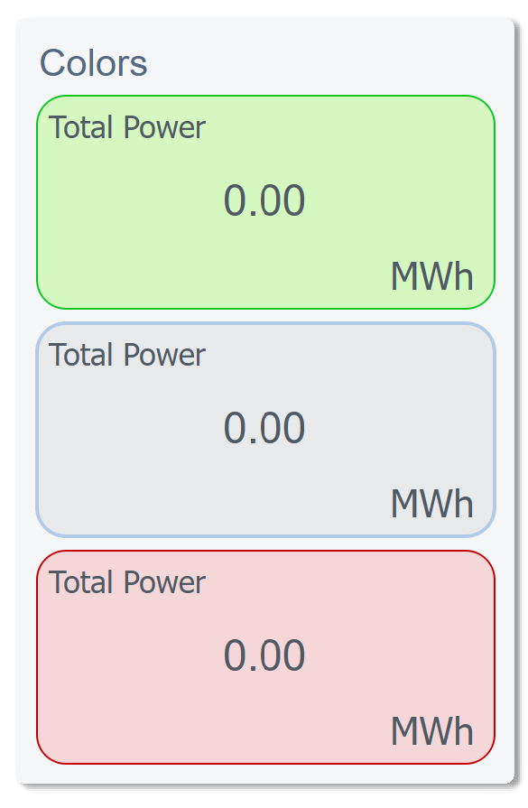
Colors & Gradients
Full color control over every element — label, value, unit, background — with gradient support:
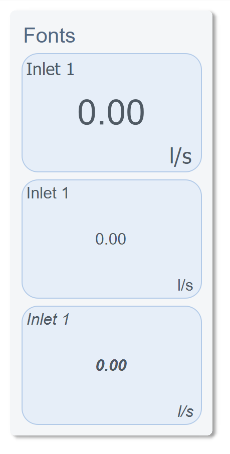
Fonts & Typography
Independent font control for label, value, and unit — with automatic scaling relative to widget size:
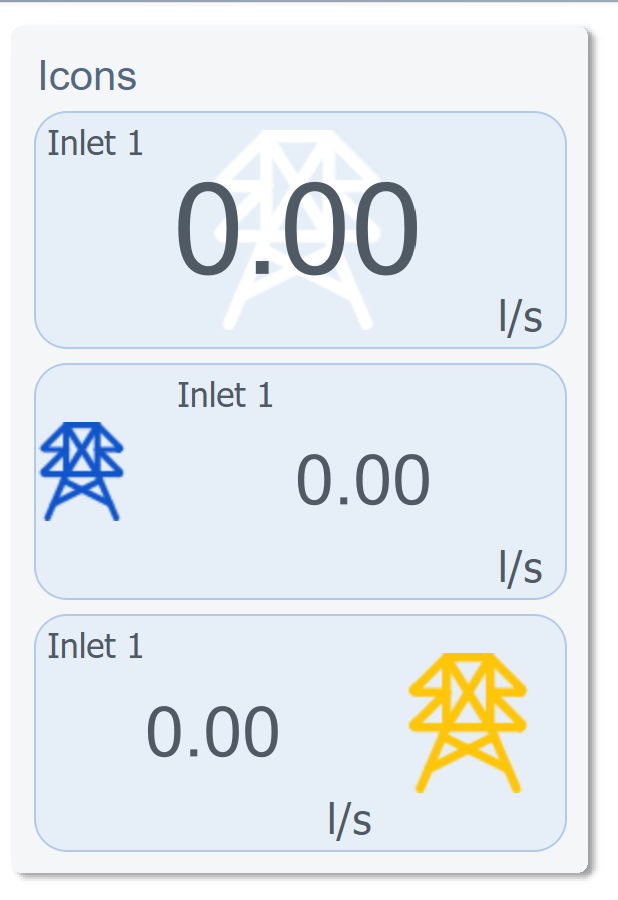
Icons
Optional icon display with SVG color override support — the same icon file renders in any color:
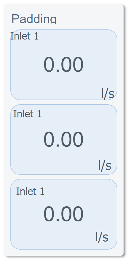
Padding & Spacing
Embedded Graphs
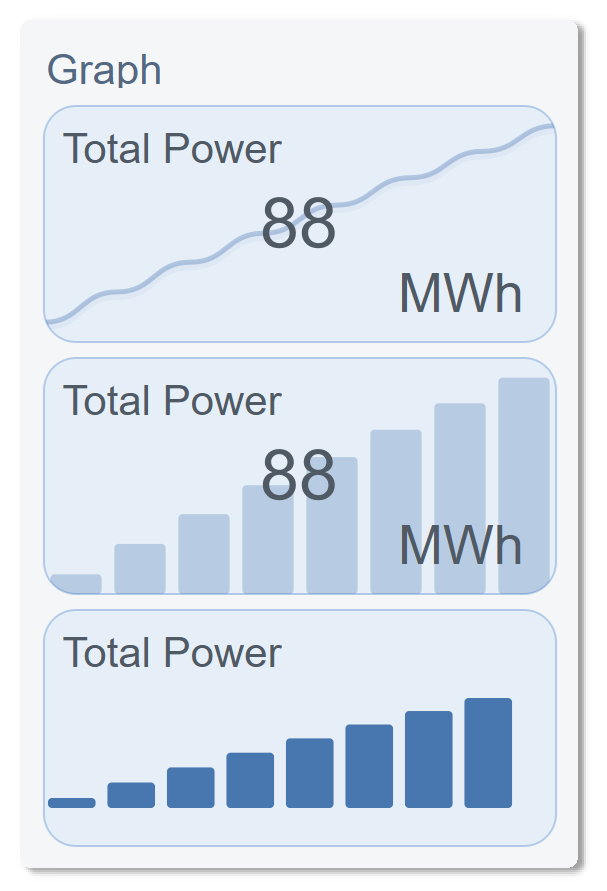
Each IoField can display a live graph in one of three styles — Line, Bar, or Area — with gradient fills, time-range filtering, and animated transitions:
Mathematical Expression Engine
We built a custom expression evaluator directly into the widget. It supports 5 live datapoint inputs (a through f) and common mathematical operations:
sqrt(a*a + b*b)        → Vector magnitude
(a + b + c) / 3        → Average of three sensors
abs(a - b)             → Deviation between two readings
sin(a * 3.14159 / 180) → Trigonometric conversion
This means computed values display directly in the UI without any backend logic — the IoField widget does the math internally, in real time.
In-Place Editing
The value label itself becomes an edit field when clicked. We implemented 5 edit modes:
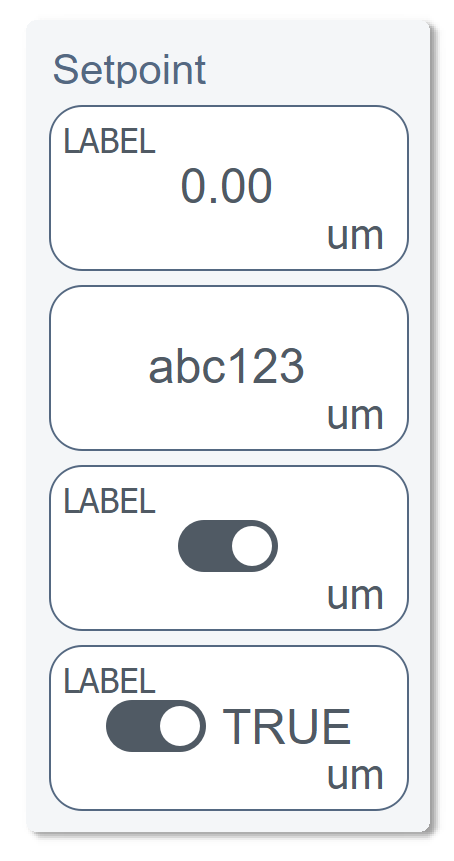
| Mode | Widget | Validation |
|---|---|---|
| String | Text input with unit suffix | Free text |
| Integer | Numeric input | QIntValidator(min, max) |
| Float | Numeric input | QDoubleValidator with precision |
| Boolean | Animated toggle switch | On/Off states with smooth transition |
| Custom | Dropdown selector | JSON-configured options list |
The toggle switch alone is a custom sub-component with QPropertyAnimation on the knob position and smooth color interpolation between on/off states.
Main Properties
| Property | Type | Description |
|---|---|---|
Text_Io |
QString |
Displayed value text |
Text_Label |
QString |
Field label |
Text_Um |
QString |
Unit of measurement |
Text_Percent |
QString |
Percentage change text |
Font_Io |
QFont |
Value font |
Font_Label |
QFont |
Label font |
UI_IoVisible |
bool |
Show value |
UI_LabelVisible |
bool |
Show label |
UI_UmVisible |
bool |
Show unit |
UI_GraphVisible |
bool |
Show embedded graph |
UI_IconVisible |
bool |
Show icon |
Icon_Path |
QString |
SVG icon path |
Icon_Position |
enum |
Icon placement (Left, Right, Top, Bottom) |
Icon_OverrideSVGColor |
bool |
Dynamic SVG recoloring |
dynamic_DPE_Value |
QString |
WinCC OA datapoint for live value |
dynamic_DPE_Alarm |
QString |
Datapoint for alarm state |
dynamic_Math_Calc |
QString |
Math expression (e.g. sqrt(a*a + b*b)) |
Layout_Orientation |
enum |
Horizontal / Vertical |
Layout_TextAlign |
enum |
Text alignment |
Graph_Type |
enum |
Line / Bar / Area |
Graph_Position |
enum |
Graph placement within cell |
Background_Type |
enum |
Solid / Gradient |
Color_Background |
QVariant |
Cell background color |
Color_Value |
QVariant |
Value text color |
Color_Label |
QVariant |
Label text color |
Edit_Enabled |
bool |
Allow in-place editing |
Edit_Type |
enum |
String / Integer / Float / Boolean / Custom |
UI_Clickable |
bool |
Emit click signal |
UI_Transformable |
bool |
Allow drag-resize |
DecimalPlaces |
int |
Value decimal precision |
Note: This widget exposes 68 configurable properties. The table above covers only a selection — dozens more are available for fine-tuned control over colors, fonts, padding, graph styling, math inputs, and behavior.
Usage Example in WinCC OA
XML Configuration (extended properties)
<extended>
  <prop name="Color_Background" type="COLOR">{230,238,248}</prop>
  <prop name="Color_Label" type="COLOR">{80,90,100}</prop>
  <prop name="Color_Value" type="COLOR">{80,90,100}</prop>
  <prop name="Padding_Top" type="INT">5</prop>
  <prop name="Padding_Left" type="INT">5</prop>
  <prop name="Layout_TextAlign" type="ENUM">1</prop>
  <prop name="Icon_Position" type="ENUM">4</prop>
  <prop name="UI_Transformable" type="BOOL">True</prop>
  <prop name="Text_Um" type="CHAR_STRING">um</prop>
  <prop name="UI_IoVisible" type="BOOL">True</prop>
  <prop name="UI_LabelVisible" type="BOOL">True</prop>
  <prop name="Edit_Enabled" type="BOOL">False</prop>
  <prop name="Edit_Type" type="ENUM">3</prop>
  <script name="editValueChanged">editValueChanged(anytype value)</script>
  <script name="editValueCommitted">editValueCommitted(anytype value)</script>
  <script name="clicked">clicked()</script>
</extended>
CTRL Initialization Script
main()
{
  // Configure a power monitoring cell with embedded graph
  EWO.Text_Label = "Total Power";
  EWO.Text_Um = "MWh";
  EWO.UI_GraphVisible = true;
  EWO.Graph_Type = 0; // Line chart
  EWO.dynamic_DPE_Value = "Plant1:Power.Total";
  EWO.dynamic_Math_Calc = "(a + b + c) / 3"; // Average of 3 sensors
  EWO.dynamic_Math_DPE_a = "Plant1:Sensor1.Value";
  EWO.dynamic_Math_DPE_b = "Plant1:Sensor2.Value";
  EWO.dynamic_Math_DPE_c = "Plant1:Sensor3.Value";
}

// Handle value editing
void editValueCommitted(anytype value)
{
  dpSet("Plant1:Power.Setpoint", value);
}
Available Signals
| Signal | Parameters | Description |
|---|---|---|
valueClicked |
— | Value area clicked |
rightMousePressed |
— | Right-click on widget |
valueChanged |
value |
Display value updated |
dynamicDPEValueChanged |
dpe |
Value datapoint changed |
dynamicDPEAlarmChanged |
dpe |
Alarm datapoint changed |
settingsClicked |
— | Settings button clicked |
editValueChanged |
value |
Edit field value changing |
editValueCommitted |
value |
Edit field value confirmed |